Design
Motion
Illustration
Character
Icon/Lists
Nature/Landscape
Lettering
Info
Open for new projects & roles!
︎ Photo Blog!
Illustration
Character
Icon/Lists
Nature/Landscape
Lettering
Motion
Info
Open for new projects & roles!
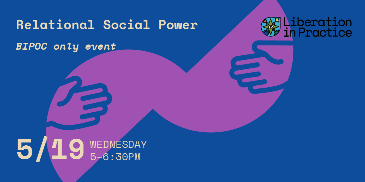
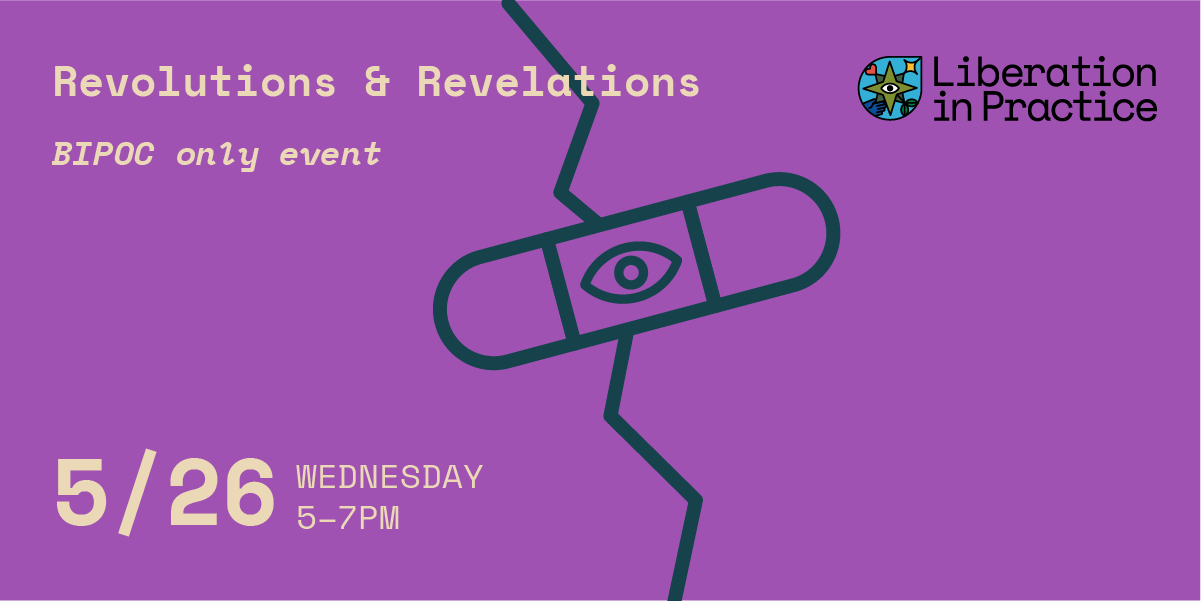
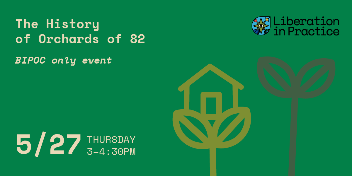
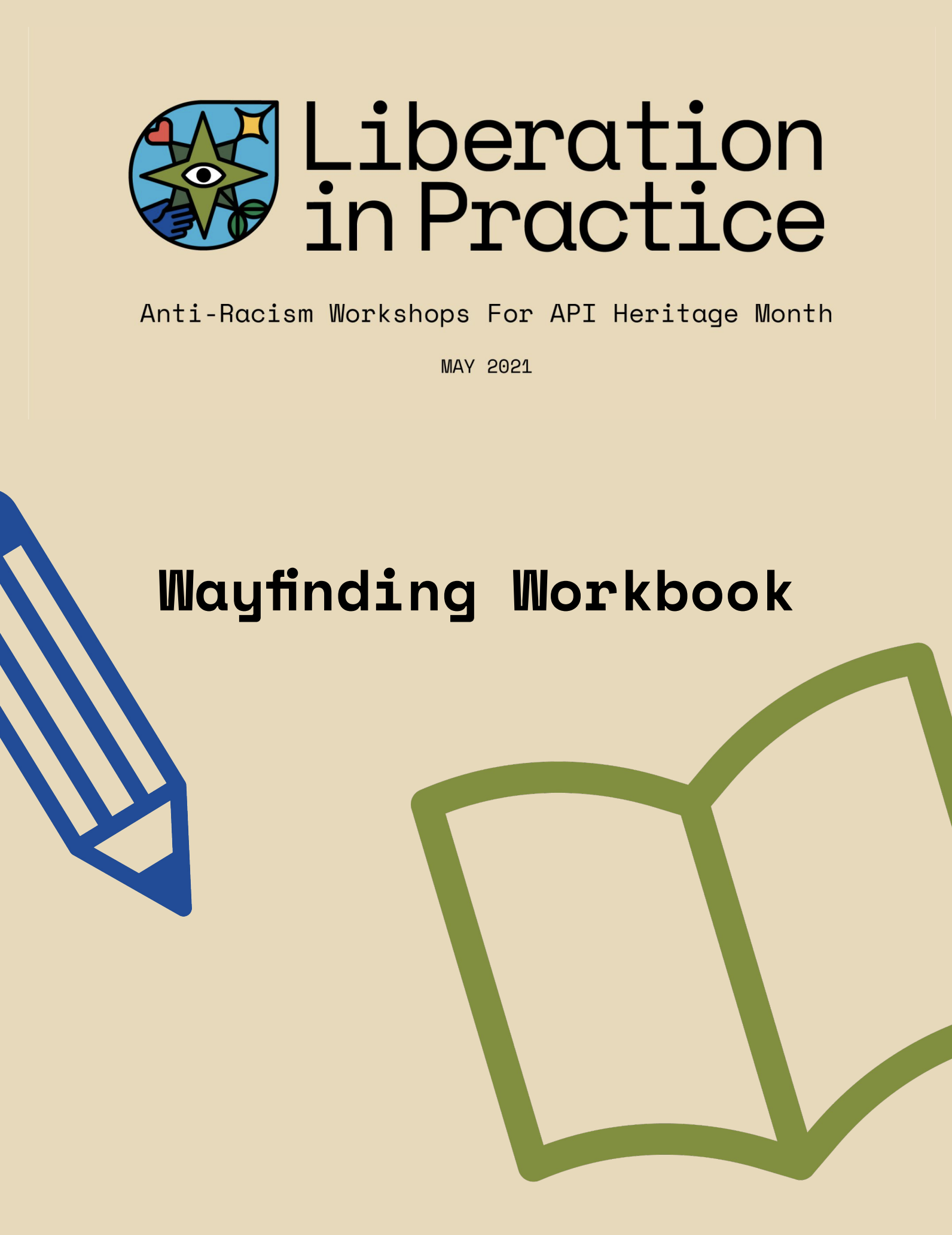
Liberation in Practice
APANO
Roles— Art Direction, Design
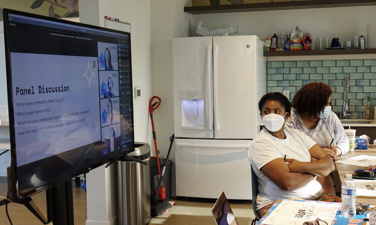
Liberation in Practice facilitates community conversations on resilience, connections, and growth. I designed a workshop campaign centered around care, guidance, community, and growth.
“The path to liberation is not straight. There are many twists, turns, and unknowns; however once your feet touch that path there is no other road to walk.”
“The path to liberation is not straight. There are many twists, turns, and unknowns; however once your feet touch that path there is no other road to walk.”
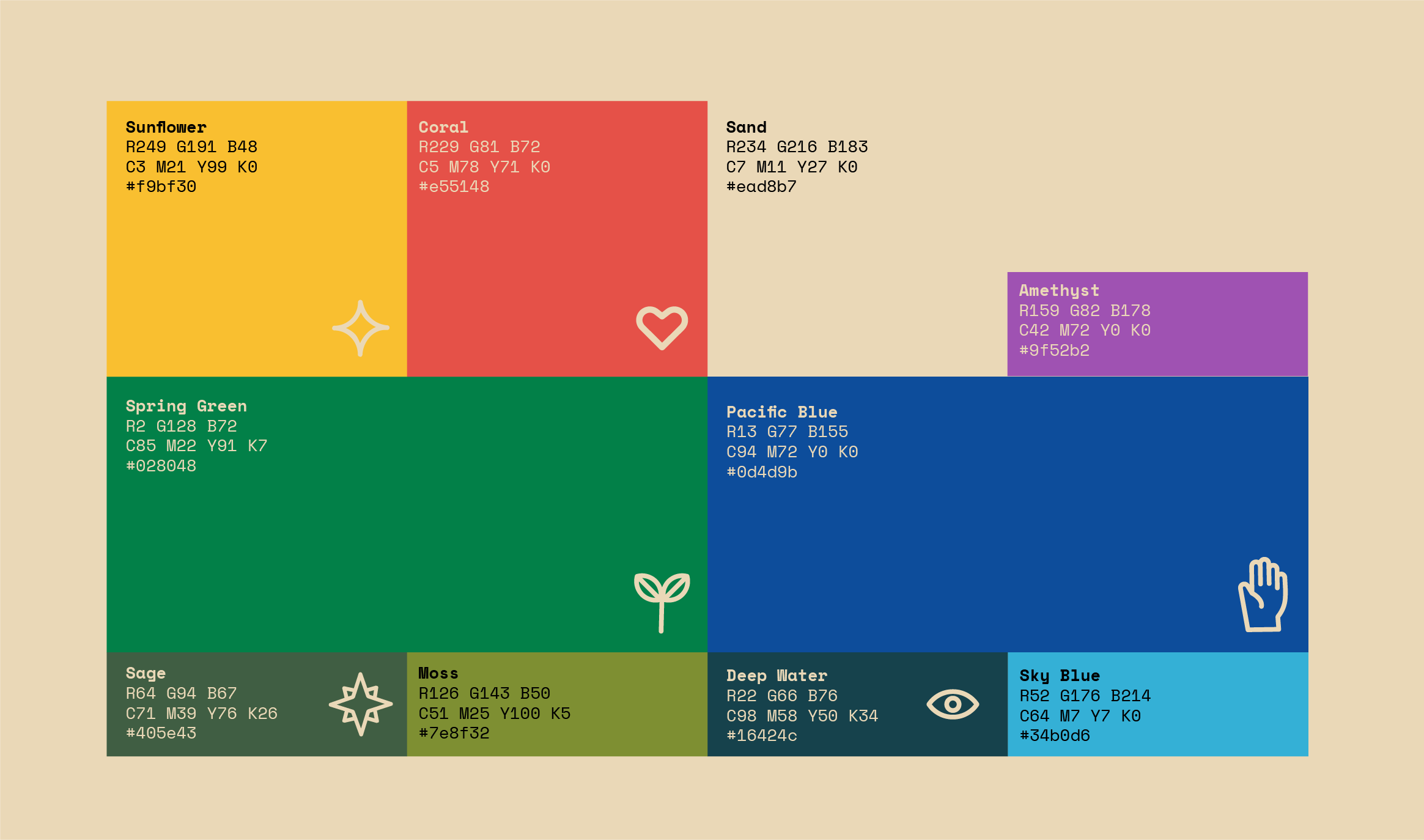
Icons
I design icons to represent the core ideas of the series and arrange them in a compass formation to visually unify them. The icons have rounded edges and thick lines to create a warm and approachable feeling, which contrasts with the blocked-off typeface. Informational but not oppressive. Energy and approachability are key to the series, as we want the concepts and discussions to feel familiar to all audiences.


Illustration
In addition to creating a logo for the campaign I illustrated indvidual visuals for each workshop to give a easier idea about the purpose for each workshop and drive interest for those more visually appealed to.